Product Design: Improving Adherence
Fighting HIV Through Package Design
Duration
5 Weeks
Tools
Sketch, Keynote, Adobe Photoshop + Illustrator
Background
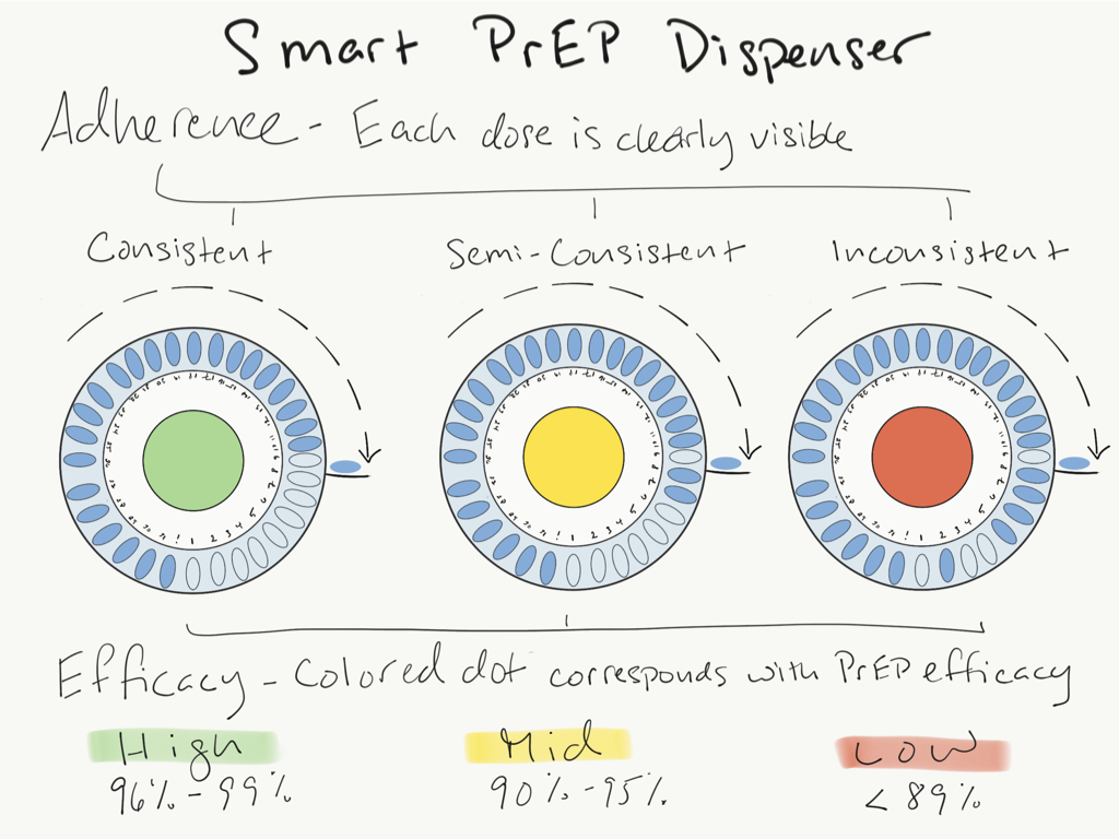
Truvada a.k.a. PrEP has changed the lives of millions of people both living with HIV and those trying to prevent contraction of the virus. Regular adherence to the drug is a key component of its ability to reduce HIV transmission. My design focuses on improving adherence by creating packaging that gives users a clear understanding of their dosing and the drug’s efficacy, removing all the guesswork.
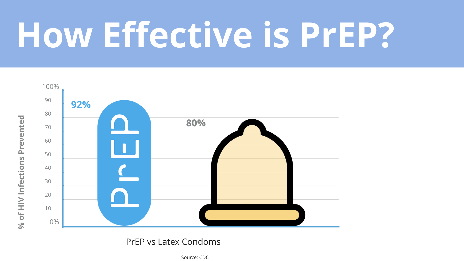
Research done by San Francisco's Kaiser Permanente Medical Center studied 600+ people who started PrEP between 2012 and 2015. Over 99% were men who have sex with men, 84% reported multiple sexual partners, and 30% had HIV-positive partners. At the end of the study they found that zero participants contracted HIV. That’s a huge success!
Source: CDC
Here’s another graph that demonstrates the correlation between efficacy and adherence. It’s clear that the higher the adherence the better the drug performs its job.
What about women…?
Before researchers discovered that poor adherence during clinical trials was the cause of low drug concentration in vaginal tissue, PrEP was thought to be ineffective at protecting women against HIV. This fact emphasizes the importance of improving PrEP adherence for both sexes. Another study, called Fem-PrEP, was conducted with over 2,100 women in Kenya, South Africa, and Tanzania. The study had to be stopped early because there was no difference in effect between Truvada PrEP and a placebo. A later look at drug blood levels found that most of the women assigned to take Truvada did not use it as recommended. Adherence was too low to detect any protective effect.
HIV doesn’t discriminate between sexes or sexual preference. So essentially Truvada could be used by anyone who is either at risk of contracting HIV or an HIV+ person that is not immune to the drug.
That’s a lot people.
PrEP Adherence for HIV -
Poor adherence has two major consequences for HIV- people. First, missing a few doses increases the likelihood that HIV exposure will lead to HIV infection. Second, if an individual who is taking PrEP with poor adherence contracts HIV there is a high likelihood that if they continue to take the drug that they could become resistant to it.
Truvada Adherence for HIV +
Similarly, for an HIV+ person, missing a few doses of Truvada can cause them to become resistant to the drug. For people living with HIV, Truvada is revolutionary and has been one of the best treatment options available in decades. Losing it as a tool makes them rely on much harsher and often less effective drugs with no hope of going back.
This project was largely driven by research and user testing. I chose to highlight these responses from my user testing because they had a significant impact on my design process.
Alfredo’s comment helped to inform the physical aspect of the design. It was important to ensure that the package would lend itself to portability.
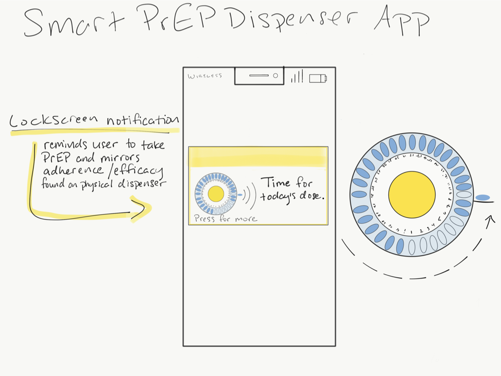
The fact that Chad never misses a dose is the result of having a regular dosing routine that helps him to automate his process. This lead me to explore an app with a notifications that would help reinforce this behavior.
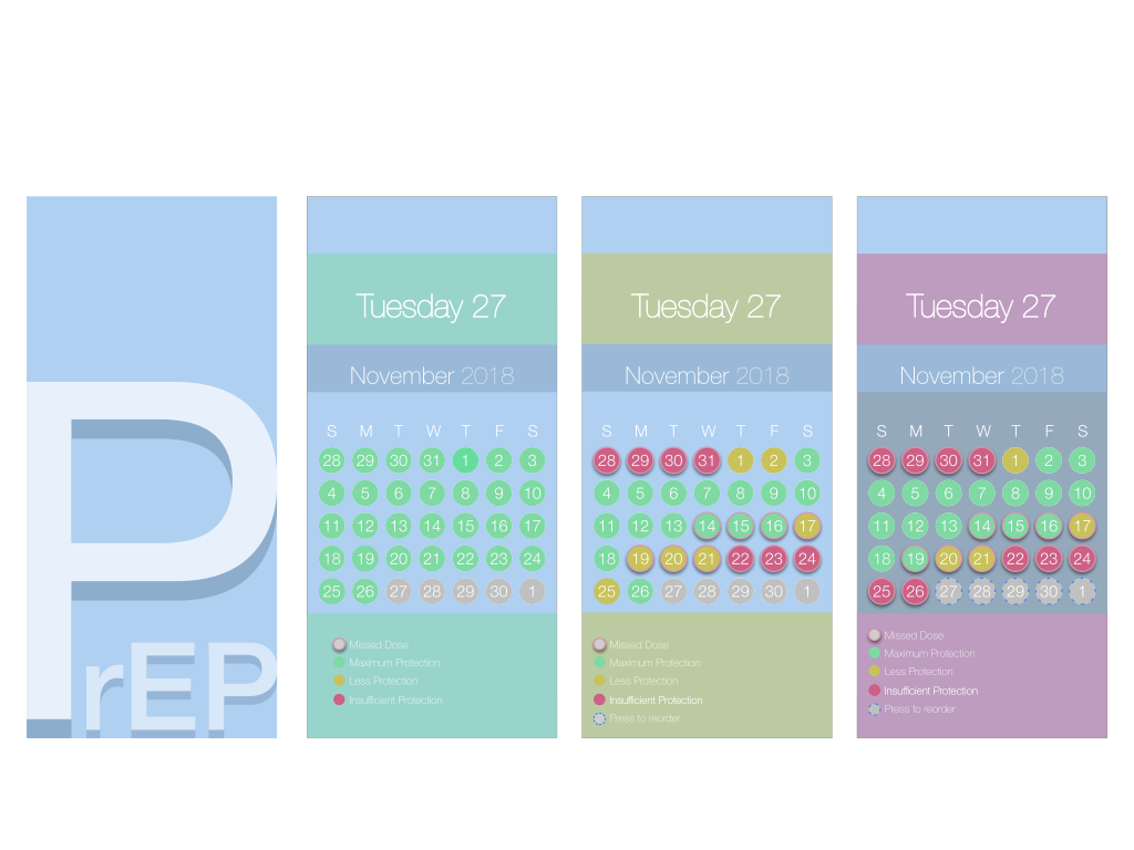
Megan is an expert when it comes to all things PrEP and HIV. She’s been working in clinical trials since the beginning of its use as an HIV prophylaxis. The key take away from our conversation was that those who take it as directed don’t get HIV. The fact that men can take it less often and still maintain protection does not mean that they have a good habit of taking it. That is why the recommendation stands at taking PrEP everyday to reinforce the habit and ensure that efficacy is consistent. This was one of the main focuses of my design. We know that people will miss a dose, that’s life. What shouldn’t happen is that people miss a dose and are unaware of their protection status. Providing that type of information to a user can empower them to make the best possible decisions when it comes to risk exposure and ideally encourage them to reduce potentially harmful behaviors.
Cegan’s feedback reinforced this notion. He admits that despite the fact that taking PrEP is a “super simple task” that it’s still possible to forget a dose. He also commented that his adherence correlates with his sexual activity which is reflected in several case studies that attempt to better understand the hurdles to adherence. One design idea that I prototyped but was less popular was tying dating app activity to increased dosing notifications. The feedback that I got was that the feature felt a bit invasive and potentially annoying enough that people would simply turn off their notifications all together.
Last, but certainly not least is Liz, who’s feedback may have been one of the most helpful in encouraging me to explore more analog design solutions. We were having a conversation about this project and she mentioned how she really likes her birth control packaging because it’s easy to carry and lets her know what doses she’s taken. She also mentioned that the discreet nature of the packaging relieves any anxiety about her birth control being instantly recognizable. She told me that “There’s something very recognizable about birth control that’s stigmatized. It’s almost like a pack of cigarettes.” So I wanted to honor that insight by designing a package with discretion in mind. Never underestimate the value of analogous research. I really like the idea of avoiding unnecessary tech for several reasons. One, we have enough gadgets in our lives. Two, I’m trying to create and encourage more affordable design, especially in the healthcare industry where high costs already prevent people from accessing the tools they need to thrive.
Research. Design….Iterate
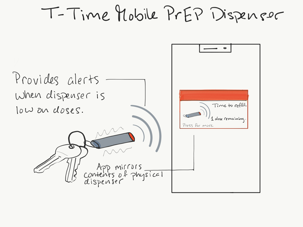
Using the feedback I received from each of my testers, I decided to hone in on making a low tech, highly portable, and discrete package that offers its user the ability to receive dosing reminders, quickly understand their protection level, and view their dosing history if needed (after all, birth control packaging has managed to do this for decades).
Which lead to my final prototype.
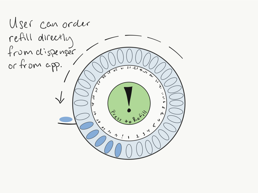
During interviews, participants mentioned that they often missed doses between refills. This packaging includes a 35-day supply rather than the traditional 30 day to reduce that risk. It also includes a 4-day snap off portion that can be left in a purse, gym bag, or glovebox for those days they find themselves without their prescription.
Several users of Truvada I spoke with are taking other prescriptions. They’d like to be able to have those drugs all in the same place using the same system. That’s why I wanted to make the case modular and interlocking to allow other drug manufactures the ability to adopt the system. This would slim down a medicine cabinet while expanding the features found in T-Time to any prescription or supplement which is a win for everyone who takes meds.
Tech for Humanity’s Sake (because who need mores apps?)
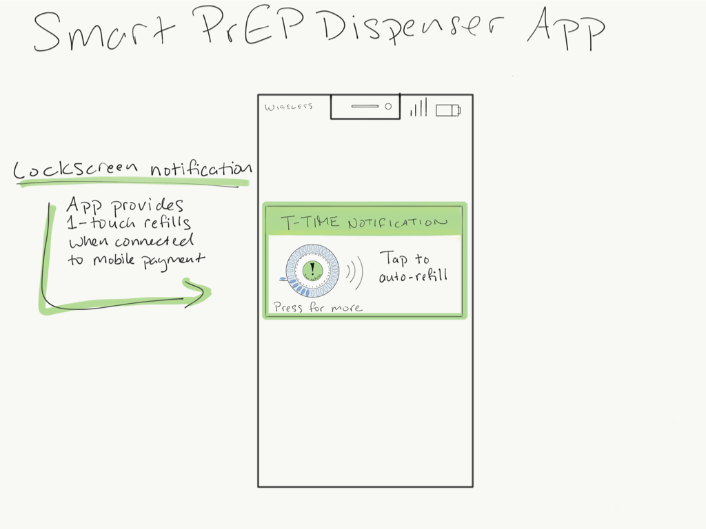
Lastly, the app component of the T-Time ecosystem uses computer vision to quickly assess the protection level a user should expect based on their adherence behavior by simply pointing your phone’s camera at the blister pack.


